Plotly Charts
 I've been working for some time on a project that requires charting and we discovered an excellent
offering from Plotly. The free open
source library really does make creating charts incredibly simple.
I've been working for some time on a project that requires charting and we discovered an excellent
offering from Plotly. The free open
source library really does make creating charts incredibly simple.
If there is a criticism (and this is very tongue in cheek) it is that the API offers so much flexibility that it is hard to say no to some of the requests from the users. There were times they wanted to alter fonts used, custom line styles, colors, etc. They wanted to respond to various events and be able to edit some parts of the data via the chart and loads more.
I should explain that I am in no way associated with Plotly but having used their product for so long (in my case in a desktop application that self hosted a web server ) I think it is fair to rave about their offering. Their site contains loads of examples and links to codepen examples. So if you are interested I suggest you go and take a look.
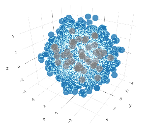
Example
Below you will see an example. This is the same as one of the samples from the Plotly site and I chose it because it demonstrates the performance you can get from this library. Being honest there are only just short of 1000 points but I hope you see a reasonable performance when loading.
This performance is also shown when you zoom or rotate the chart. However something that is important to realise is that the fact that there are only 1000 points is not an immediate indication of an issue. If we had had many more points then possibly this type of chart would not have been suitable but because Plotly offers so many other charts part of the skill is choosing the right chart for the purpose.
Mobile Users
I hope you too can see the chart works really well for you. Pinch to zoom is not supported which is a bit of a shame but you can use the menu from the top right to change how touches interact with the map.
Performance
Coming back to performance. For one client it was necessary to support up to 5 million points on a 2D scatter plot. The purpose of a scatter plot can be to show how data on one axis relates to data on the other. If broadly there is a linear relationship then you might expect data to be clustered along a line, but with 5 million points even the outliers might fill the chart space making the trend difficult to see. The solution chosen was to allow the user to specify a level of random decimation so that fewer and fewer points were displayed. However alternatives are a heat map or a surface plot and plotly supports both of these.
For fairly trivial charts, such as the one shown above, retrieving and loading the data is not going to be too demanding. This examples loads the data by using d3 to read data from a csv file served from the site, but if your data is far more massive then there are two bottlnecks.
Firstly retrieving the data from whatever the source may be (files, a database, web services, etc), if these are slow then the user is going to have to wait. Of course a solution there can be to prepare and cache the data upfront where possible and where that makes sense, so that individual users do not burden the server and have to wait.
Secondly there is the rendering time. My preference would be to choose an appropriate chart that allows the user to visualise the data, but if that is not possible and it is necessary to plot a lot of data then Plotly, as an alternative to SVG, can use WebGL. That is or was supported by slightly fewer browsers but is now generally supported by major desktop and mobile browsers. We found it generally to be very fast rendering those 5 million points in seconds rather than 10s of seconds.